InMoss Essential Oils
A pure drop of the Australian bush, capturing its essence in a collection of pure essential oils.
What I Delivered
• Branding identity
• Custom merchandise design
(bottles, gift bags, & packaging)
• Custom illustrations
• Visual identity
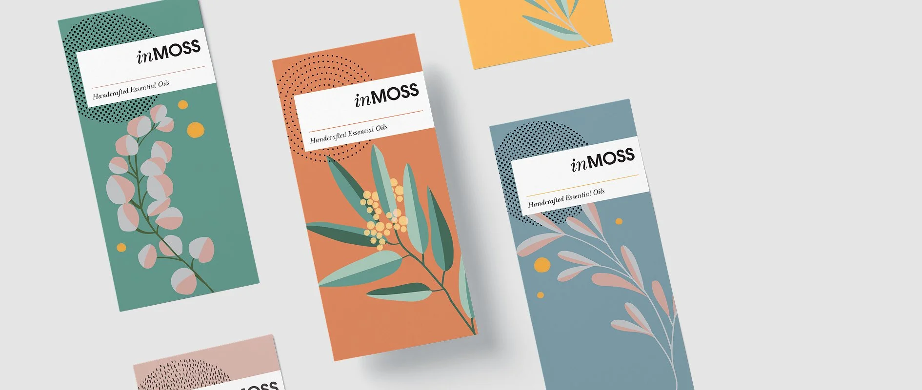
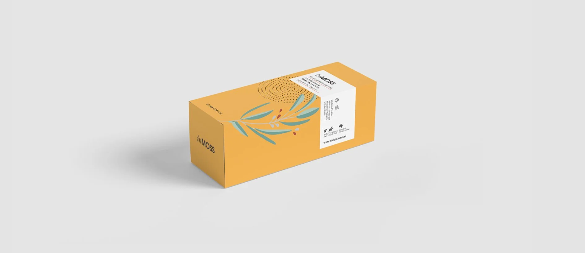
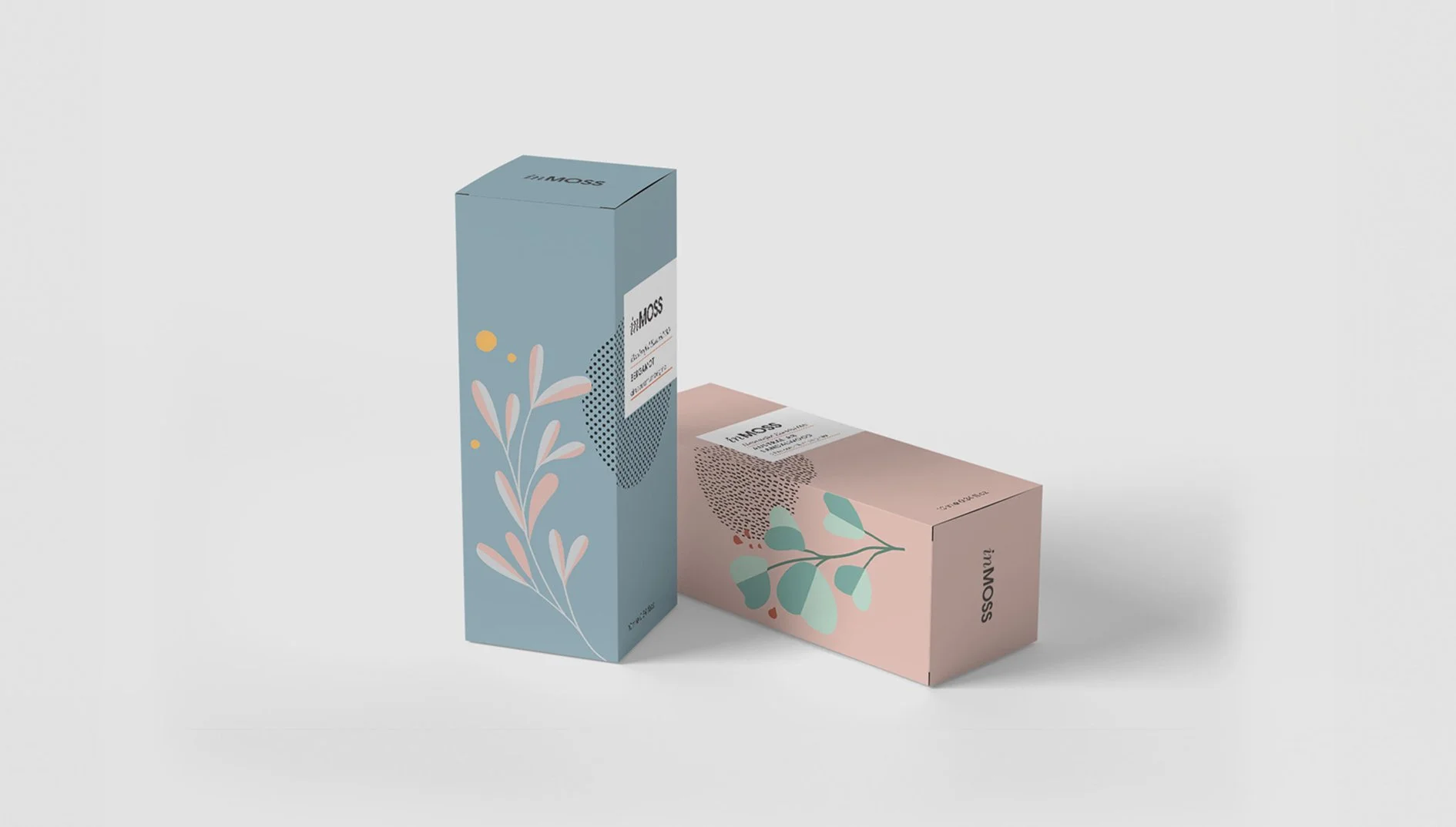
• Brand pattern illustration & graphic elementsThe brand concept revolves around the idea of "a pure drop
of the Australian bush," encapsulating the authenticity and natural beauty of the region. This commitment to purity is evident in every aspect of the brand, from sourcing to packaging. The design philosophy behind InMoss emphasises quality and simplicity. The packaging showcases custom illustrations inspired by Australian botanicals, paired with a soft, earthy colour palette including muted greens, blues, and pinks. These tones evoke a sense of tranquillity and connection to nature whilst maintaining a contemporary aesthetic.The typographic lockup is clean and minimalistic, reinforcing the brand’s focus on purity and sophistication. The brand’s visual identity aligns seamlessly with its ethos—celebrating nature whilst delivering modern elegance.
The thoughtful integration of design elements creates an emotional connection with consumers, positioning InMoss not just as a product but as an experience that embodies the spirit of Australia’s natural heritage.